

Beaverton Symphony Orchestra
Task: Design a “Fall” themed poster for the Beaverton Symphony Orchestra (BSO) concert.
Criteria: A poster including the BSO (Beaverton Symphony Orchestra) logo, dates, location, and artists playing.
Ideation

From the various colors used these six colors were the pioneers for the background I created.


Main Color Palette used in the making of the "Fall" look & feel.


With the combination of these two my "Fall" look & feel is done
But the story is not done.
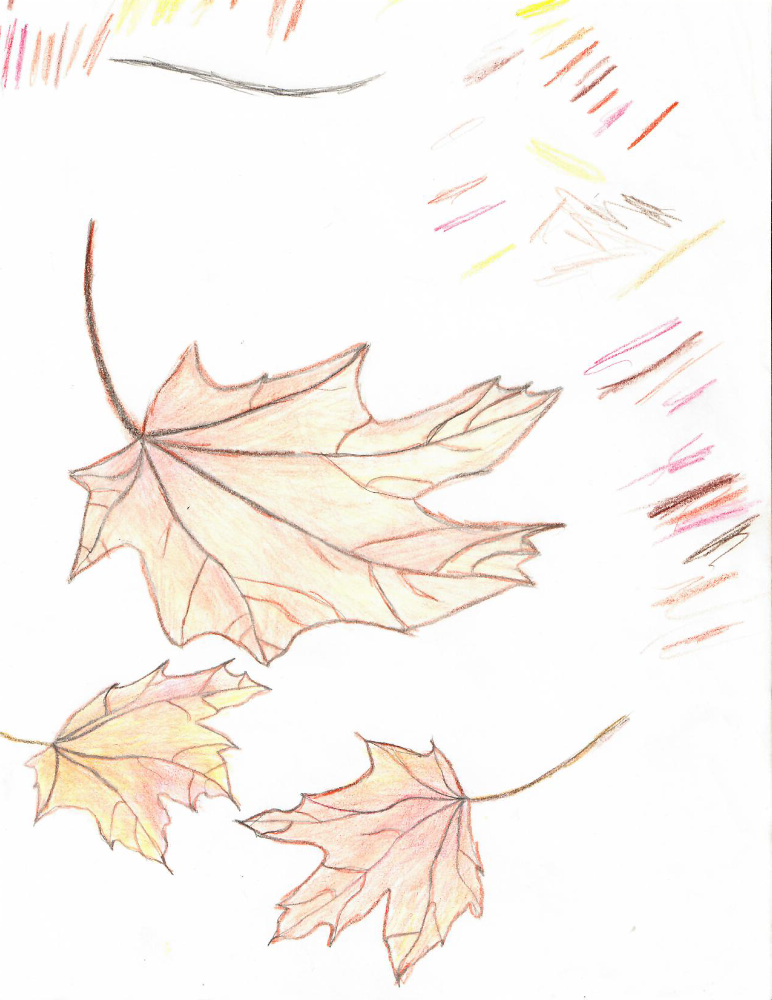
Being a musician myself and having played in the band when I was younger. I wanted to incorporate the music notes that would be on a music sheet.
I noticed that each note has its own personality just like the serifs on letters in typography. I decided to use that to my advantage.

Each music note is unique and plays a different tone, each tone has a different impact.
Creation

I had to make sure that enough of the “Fall” look & feel would be translated when I was ready to add the music notes and typography.
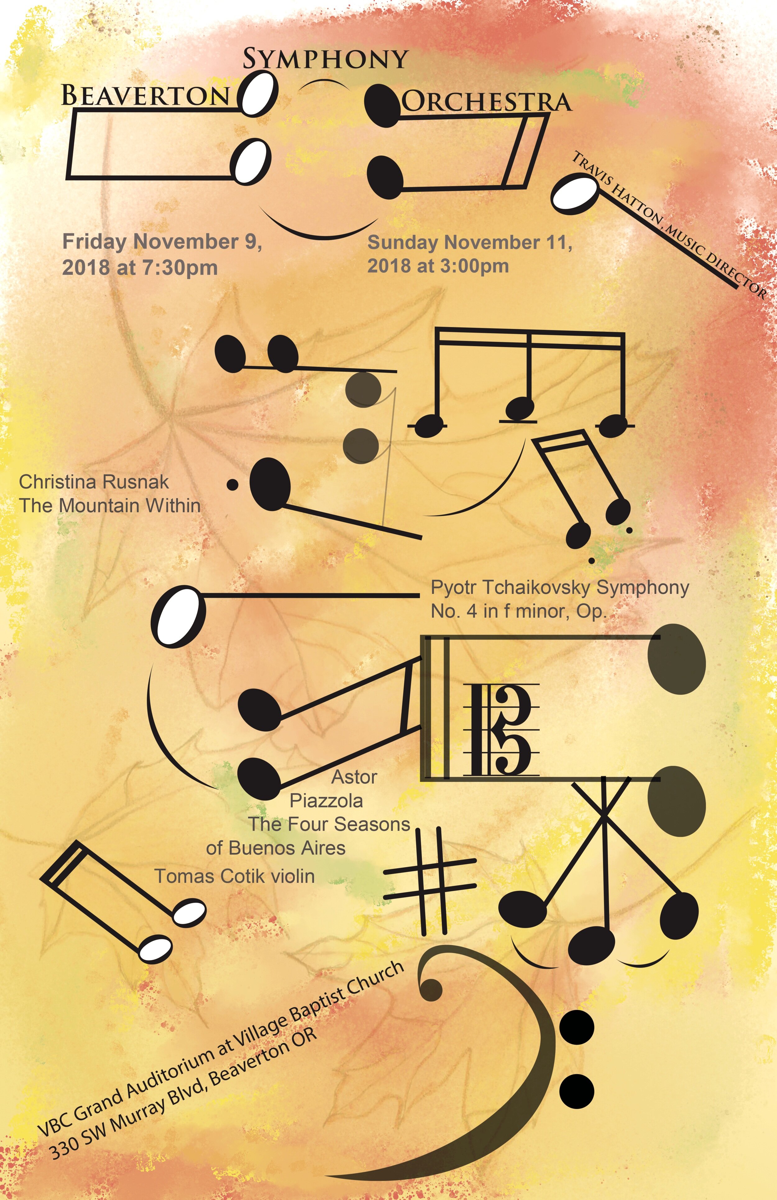
I was tasked with creating a poster but this was also a competition between my classmates. The BSO comity would pick one of our posters to use as the poster for the upcoming Fall concert.

Mine was picked!