Clown Hospital
Clown Hospital
Task: Build a brand for client wanting a more professional look & feel for his business.
Criteria: Brand development, logo, slogan, name, letterhead, business card
BackStory
Before I take you on this journey I must give you the overview. For this task I was not alone when building the client’s brand. I was in mini design firm, I like to call it. It is a mini design firm because we were in class still, but it was run like a design firm.
For this client we had a group of three to four people working on it at once. What I will show you is our ideation and my journey building a professional brand.
I hope you enjoy!
Ideation

Starting a rebrand of a business you must find what your competitors are doing right and wrong. So, we started with different competitors logos, slogans, and websites if available.

Through research we narrowed the top logos to these company’s.

As well as a logo our client needed a proper name to coincide with the logo. Along with researching for company’s logos we brainstormed different names that kept the same fun vibe but can still look professional.

When picking a name we had a bunch of names put together. Then we had our artists working on the project as well as others artist vote on which name they liked.

When deciding on a slogan we had to shuffle through many types of slogans some funny and some serious. These were our top slogans that we thought kept the same fun vibe of a clown but could still be professional when needed.

My journey begins here.
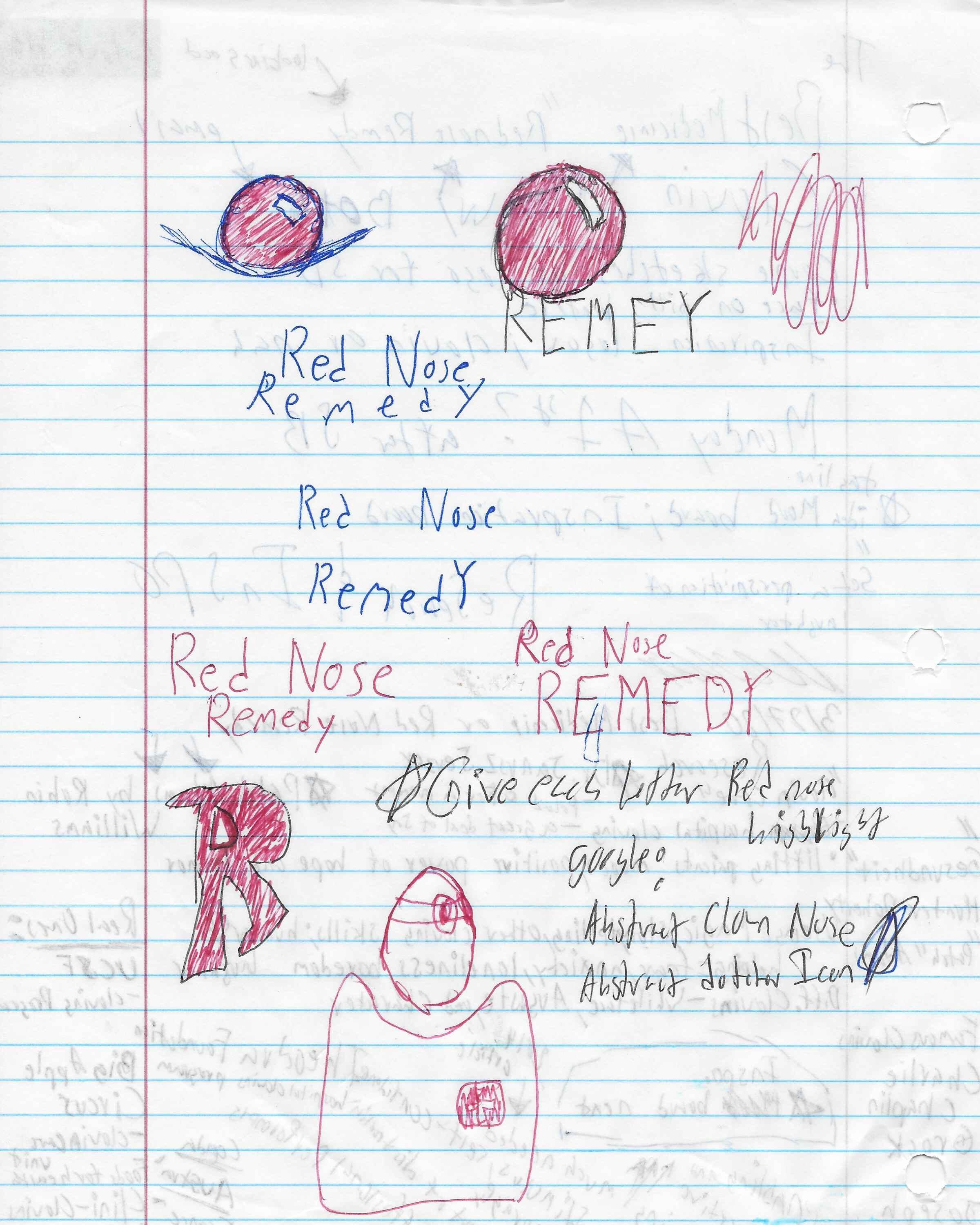
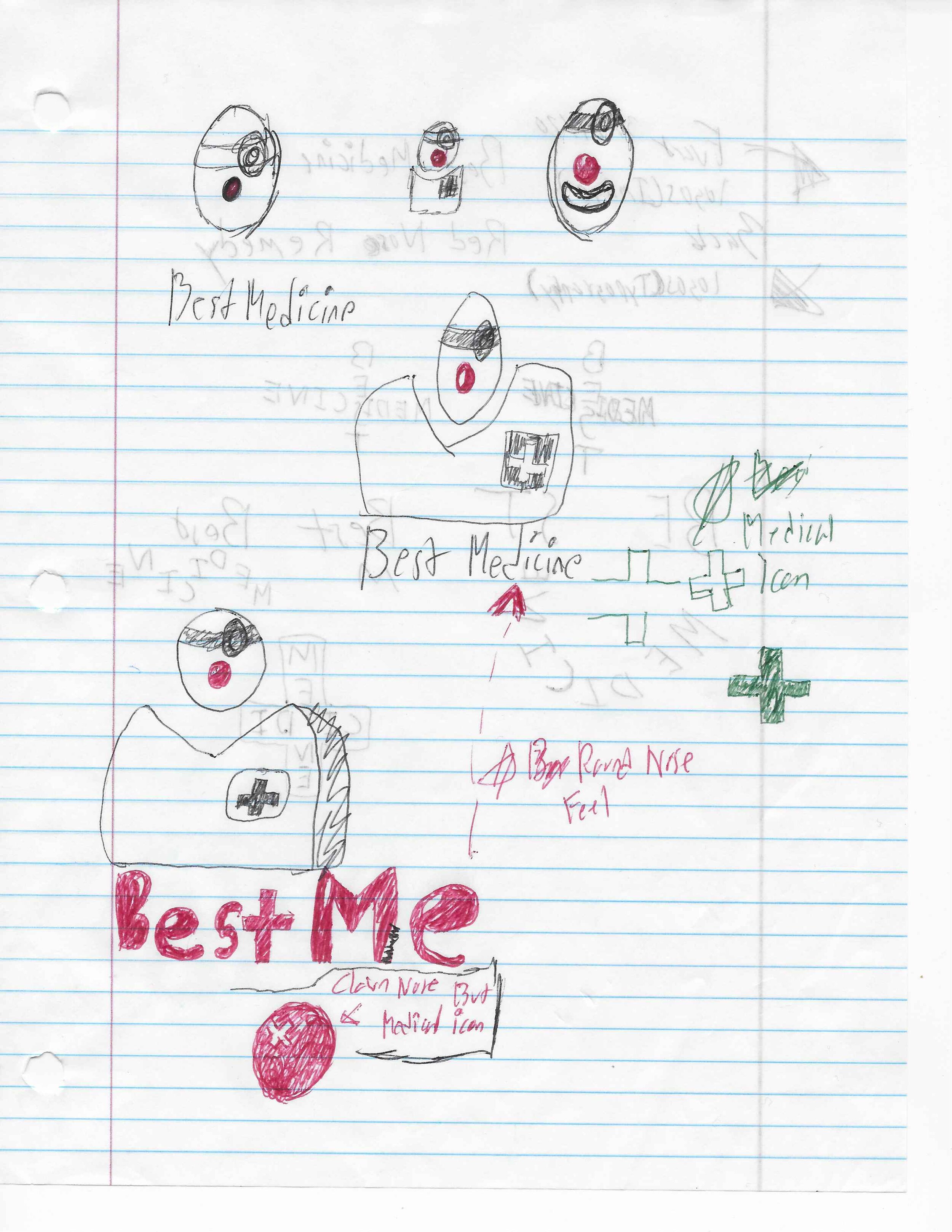
With any project your first step should be research and sketching. So, I found certain logos that caught my eye and used it for inspiration.


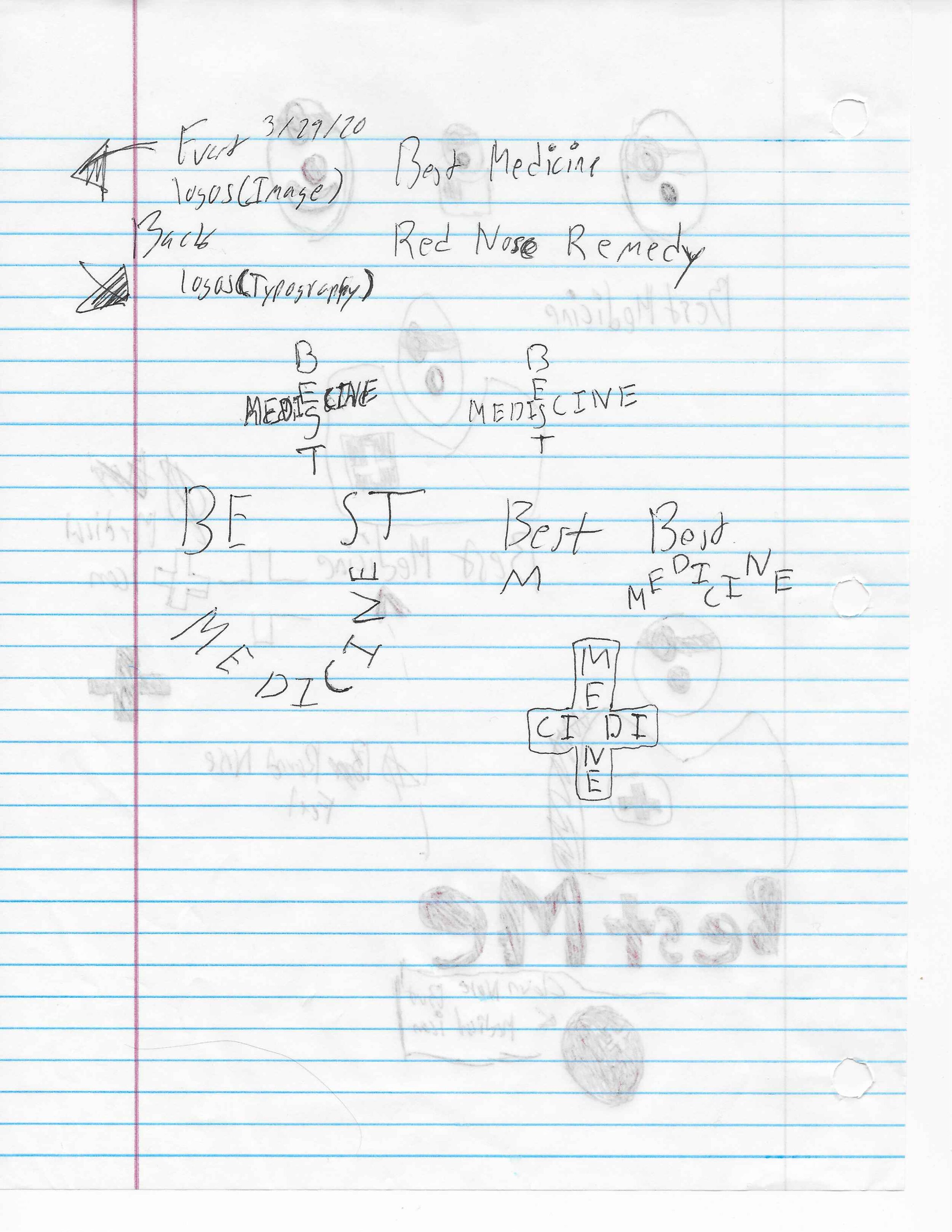
In my research I found the red nose of the clown would be a key factor, as well as the icon for a hospital or medicine in general. Along with playing with imagery and symbols, I wanted to see if typography could be either a bonus to the logo or become the logo.

Having the big red nose I realize that was going to be a vital factor to achieving a professional logo. After finding certain images to start from I wanted to really focus on the red nose.
As an artist it is our job to think inside the box and outside the box. Sometimes you combine elements to see if they work together or if it grabs too much attention. Two elements I combined were the red nose of the clown and the icon for a hospital.

Focusing on the nose I was looking at the highlight and wanted to use the hospital icon as the highlight.

Once I combined those elements my next mission was to make it flow. It was a good move but needed to be worked.

When I was talking about working the elements this is what I meant. I worked the size, shape, color, type, font, and position of my logo. As it’s shown above adding the typography I was able to work it as an accent to my big red nose.
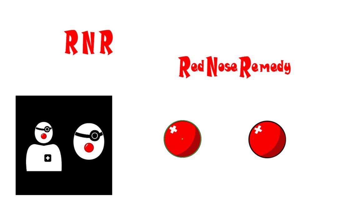
After working and reworking my logo resizing the hospital icon and messing with the typography I came up with this.

With help from my fellow artists having colored typography helped with the flow of the logo.
What is presentation without a mockup.


This is the final look & feel for my logo. I put it on a letterhead and business card.


Since we were working for a client we had different options to pick from. Mine was not picked but I still wanted to show my talent and excitement designing.
I do hope you enjoyed this journey with me going through the eves and flows of designing. Also, hope you smiled or got a kick out of this project since I was designing a clown nose whose purpose is to bring hope, joy, and loads of smiles.
